
Breaking the Financial Mold
Dividnd reached out to us with a clear objective. Build a brand with real charisma and impossible to ignore.
We shifted the narrative by introducing a living, personality-driven brand ecosystem built around core characters.
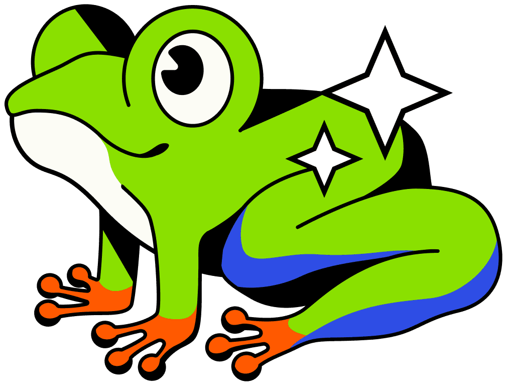
The Frog
Our main hero, bringing energy and confidence to every screen.

The Growing Tree
A visual metaphor for portfolio expansion and long-term gains.

The Piggy Bank
A modern, playful twist on asset security.
Brand Built to Stand Out
Bold Typography
Heavy, confident display type paired with clean, functional font for maximum legibility and impact.


Loud Color Palette
Electric colors, deep contrasts, and vibrant accents designed to pop on any screen.

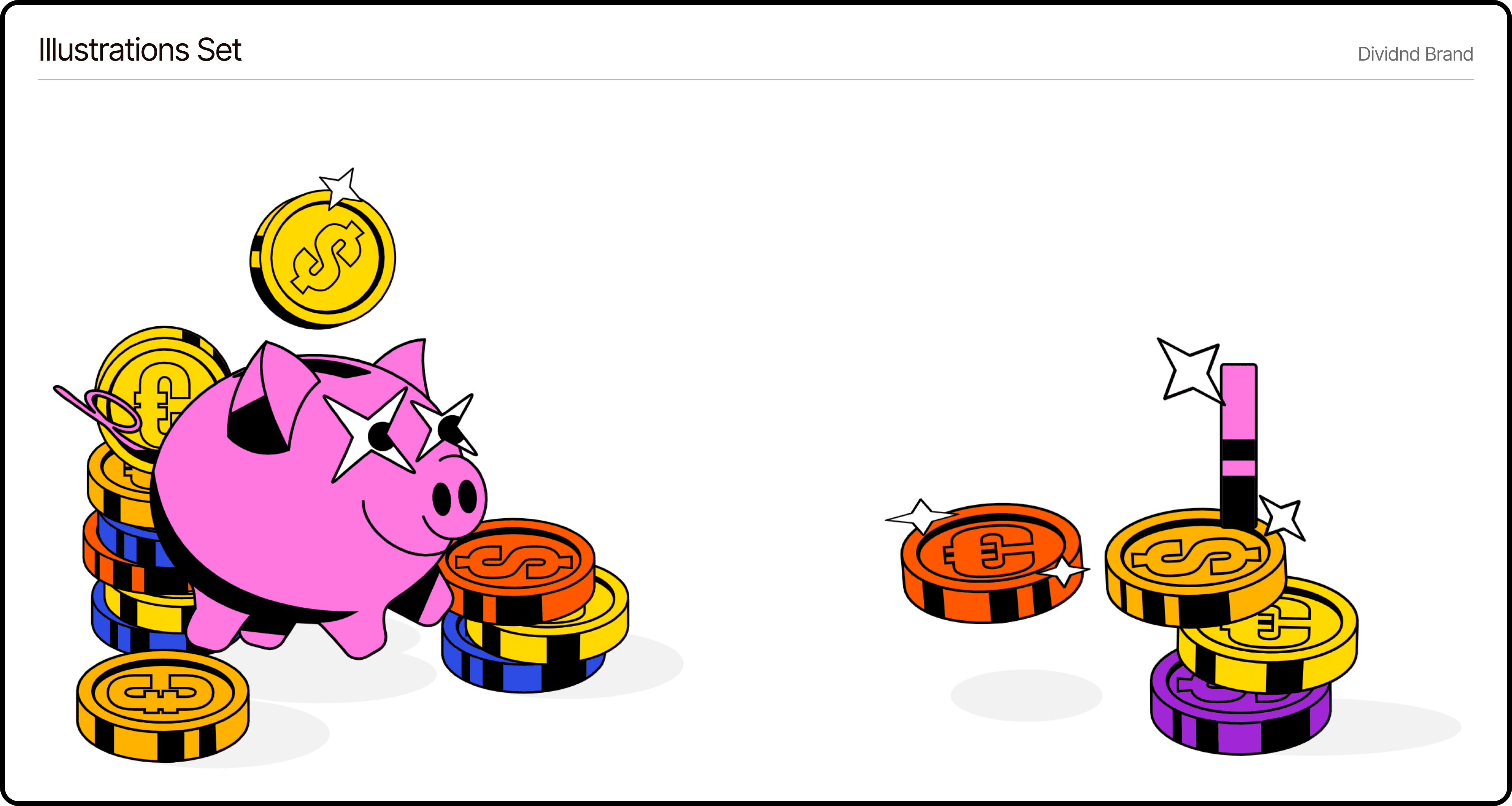
Hand-Crafted Illustrations
100% custom, hand-drawn artwork giving the brand a distinct, unrepeatable visual edge over generic stock finance vectors.
Micro-animations
We made Dividnd feel genuinely alive at every touchpoint.
Playful Motion Design
Interactive Animations
A bold brand identity demands a web execution that feels just as fast and alive.
We translated Dividnd’s illustations into an interactive space where every action delivers instant visual feedback.
Dividnd Alive in the Browser
Unique Webpage
Real charisma, bold typography, snappy motion.
We translated Dividnd’s visual system into a high-performance web experience where every scroll, hover, and interaction delivers instant response.
Instead of standard corporate templates, every screen is filled with a unique brand vibe that keeps users engaged, entertained, and ready to convert.